Monday 29 June 2015

Masking Scapes

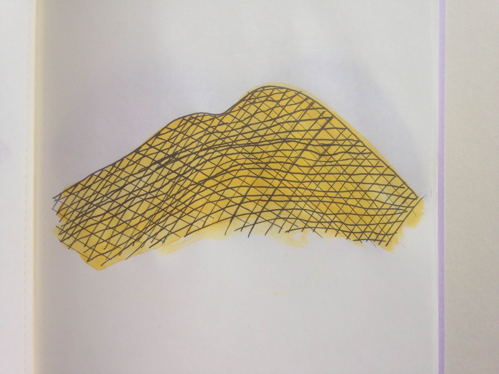
Since finishing my first year at university I now have loads of 'free' time to do some of the things I have wanted to do for a while; Get better at cooking, visit new places around Leeds and of course, make some art that isn't directly related to Uni. So far the cooking has been going well, I have successfully made some tasty meals without killing anyone. The traveling has been steady as it costs money I don't really have. And the art has been productive; I have kept a sketchbook going and painted a series of landscapes so you could say it's going well, but I want to know what you think?

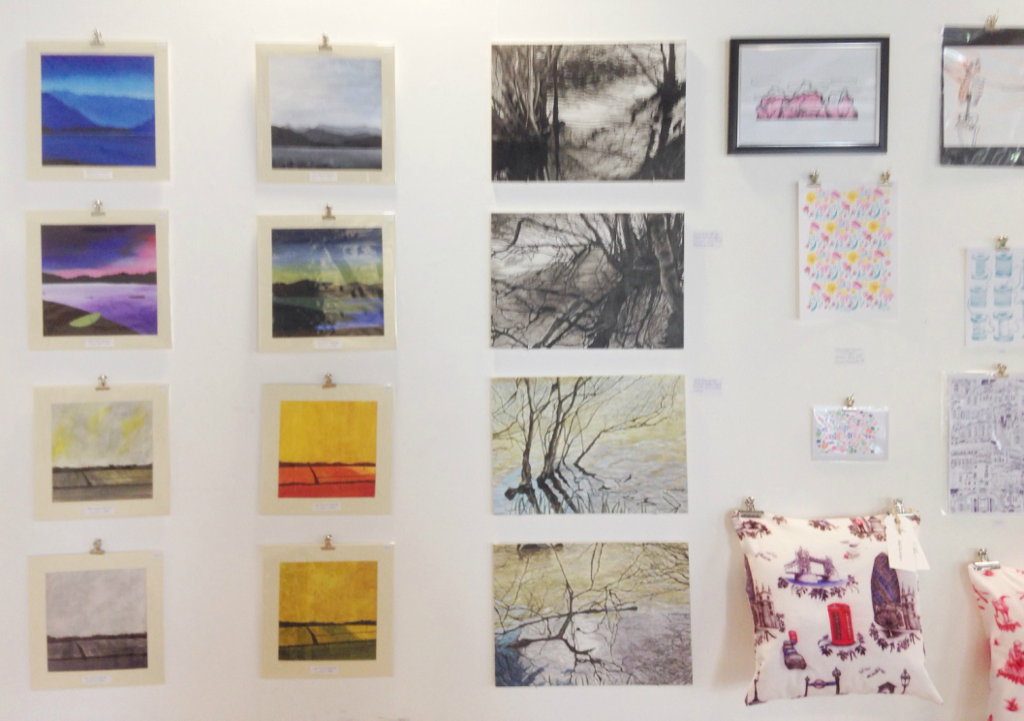
Following on from my theme of landscape paintings I finished at the end of the academic year (which I posted about here) I decided to experiment with other ways of painting them. The aim was to also try out painting on different surfaces to see which I prefer; Paper, MDF or Calico, and after finishing the paintings, the answer is Calico. This is because even after the priming process, the surface is smooth meaning you can get a flat finish with your paint, leaving you with a surface that is easy to paint onto. This of course is my personal opinion based on my style of painting, what do you prefer to paint onto?
I then spent a few days collecting images of exotic or interesting landscapes I came across on Instagram until I had a small reservoir to paint from. I was drawn to landscapes with lots of water, sky and/ or mountains because of the shapes and colour they contained. I then did a small series of watercolour sketches on scrap bits of paper to test out colours and compositions before going onto doing the real deal. Is this something you do before you start?

Then came the actual acrylic paintings. I went for a technique of using masking tape as a stencil to create the shapes, hence terming the series Masking Scapes. I used a craft knife to cut out the contours of the mountains and delicately stuck them onto the surface before painting in the section. Next was the best part - peeling off the tape to reveal the crisp, sharp edge of the mountains, sea or rocks. I found it best to work from back to front, starting with the sky and ending with the sea or land in the foreground, layering up the colour on top of each other, and I am pleased with the results.
So what do I think of the series of paintings? I believe they are successful because they are different to how I would normally paint landscapes; bright and minimal. They have a contemporary feel with the vivid colours and block shapes which is what I was going for. I love the intense coloured ones but I also really like the monotone ones, such as the black and grey one and the blue one (bottom left and bottom right). This is because I liked the challenge of painting with a limited colour palette, changing the colours whilst keeping it looking relatively realistic.

In the future I plan to do a similar thing - experiment a limited colour palette, possibly black and grey. I would also like to try and keep along the minimalist style, maybe using collage, cutting shapes out of painted paper to form my compositions. Until then though, I want to know what your opinions are of this series. Do you prefer the bright coloured paintings or the monotone paintings? Would you consider using masking tape like a stencil in your own practice? and what do you think of my ideas for future projects?

Friday 26 June 2015

Daily Drawing Update - Week Five

I have to admit I struggled with motivation for this weeks daily drawings following from a week I was unhappy with. I decided to go more abstract so that I didn't have to think to much on a subject matter, it all came from mindless doodling but I don't think that's a bad thing. Creative block is something I am familiar with being an artist so sometimes I just have to step back and do something slightly easier to get my head back in the game. Hopefully next week will be a better one!
#29 - Green.
#30 - Blue.
#31 - Orange.
#32 - Yellow.
#33 - Red.
#34 - Brown.
#35 - Purple.

Wednesday 24 June 2015

The Art Market - Review


This year was the first year Leeds College of Art have held an Art Market to run alongside the degree show so you could say we were the guinea pigs to test the waters. Going into it I had some doubts that it would be a bust... but I was very mistaken. I will admit I had visions of an unorganised mess with no resulting sales and wasted time, however it proved me wrong. Once we had spent the day setting it up in the canteen it started to take shape. There was a great variety of things for sale from paintings to prints, badges to magnets and jewellery to cushions. Everyone had put a lot of effort into packaging, pricing and displaying their work along with business cards to make it all professional. The shop looked amazing and so I thought I'd show you some things.


The Art Market appeared to be a great hit with the public with the opening night taking just under £700 worth of profit between all of the sales which was fantastic! Cards, earrings, keyrings, coasters and small prints seemed to be the most popular things to buy as they are 'pocket money stuff' - things that cost a couple of quid people can spend their change on. Having said that plenty of other things were sold including handmade sketchbooks, zines, large prints and paintings. I personally sold a few paintings which is awesome! The takings through the whole event added up to over £1,700 which is amazing, it makes me wonder why it has never been done before! I know now it will happen again as it is such as good opportunity for us to sell our work and you don't lose anything for doing it (apart from a little time). If you are from Leeds College of Art why not think about participating next year? You've got nothing to lose; you learn a lot about preparing your work to be sold and you might make some money. I will definitely be doing it next year and I hope you will too!

Monday 22 June 2015

DIY Workshop - Mount Cutting

As I mentioned in this post, I was selling a selection of my paintings in The Art Market at the Leeds College of Art Degree Show, Going Going Gone.

As part of getting getting ready for The Art Market, I spent a few weeks preparing and presenting my works to be sold throughout the duration of the show. This included mounting, backing and wrapping my paintings to make them look neat and professional so people would be inclined to buy them. (That was the theory anyway!) In the interest of you I have decided to write a post that acts as both a tutorial of how to make your own mounts and a review of this Jakar mount cutter. I bought this mount cutter at The Range, but you can also find them online at Ebay or Amazon.

When I bought the mount cutter, I also got the matching ruler which allows you to easily slide the cutter along the ruler using the groove in it. The cutter enables you to slice paper and card at an exact 90° or 45° angle, which is handy when wanting to cut your own mounts for framing your beautiful artwork.
The first thing you want to do is work out how wide you would like your border to be around your picture. To get an idea of how thick you want it to be it could be useful to place your artwork on the mount board and draw out some guidelines. (I usually go for a border that is no bigger than 4 or 5cm depending on how much board I actually have). What you want to do is measure the dimensions of the piece of work, then add on double the desired border size to the height and width, and cut it out.

For example; 

If your painting is 20cm x 20cm and you want the mount to be 5cm in width, you want to cut out a square that is 30cm x 30cm.
Or

If your drawing is 40cm x 80cm and you want the mount to be 4cm in width, you want to cut out a rectangle that is 48cm x 88cm
Now you have your square or rectangle of board cut out, it's time to cut out the aperture. (This is the hole in the middle of the board where your picture will be framed within). However, before you do any cutting, you need to mark where you will cut, as you want the hole to be bang in the centre of the board. To do this, measure the desired border width from each edge of the board and lightly draw the line you will cut. Once you do this there should be a smaller square drawn in the middle, which you will cut out.
If I use the first example, I would draw a line parallel to each edge that is 5cm from it, leaving me with a 20cm x 20cm box in the middle of the 30cm x 30cm board.

Next comes the actual cutting! Set the cutter to the 45° angle and place the ruler along one of the lines. 

Note 1: To get the bevelled edge correct, cut the line with the cutter pointing inwards to the centre of the board!

Note 2: While cutting be sure to go at a slow pace. This is because when you push the cutter to move quickly, the blade gets forced into the board, leaving you with a bowed cut rather than a straight cut.

Great, Now you have your mounts cut! The next step is to stick your picture to the mount. To do this, put the mount face down and tape the picture to the back of the mount. (I find it best to use masking tape as it offers the opportunity for the picture to be removed from the mount later on without damage).

Now all that is left is backing the picture to hide the tape. Cut out some paper that is exactly the same size as the mount and stick it to the back of the mount with something like PVA glue or double sided sticky tape. (I usually try not to stick anything to the actual picture so that it can be removed from the mount without ripping).

And there you have it, a quick DIY lesson on making and mounting your own work!
So what do I think of the Jakar mount cutter? I think it is a great product that you should really consider buying if you are wanting to mount and present your artwork. It is simple use especially with the groove in the attached ruler, making it easy to slide along. It is perfect for works smaller than 60cm as long as you go slow with the cutting to avoid the bend. Anything larger can still be done but requires some accuracy as you have to move the ruler. The greatest thing about it though is that you can cut yourself any size mount you want, as many times as you want! 

Friday 19 June 2015

Daily Drawing Update - Week Four

This week the challenge was to draw our future house family in the style of Buttonfruit in black ink. I chose to draw all of our profile pictures from Facebook as a point of reference. I'm really not happy with this weeks drawings, but sometimes you got to try something different to see what works for you and what doesn't. You can't produce something you 100% love all of the time so you just have to experiment and not let it get to you.
#22 - Me.
#23 - Amy.
#24 - Rhian.
#25 - Hannah.
#26 - Joe.
#27 - Zoe.
#28 - Tyler.

Wednesday 17 June 2015

Film Fun with a Thumb


I bought a disposable camera in the hope that I could get some cool film photographs but I was slightly disappointed to see my finger had managed to make an appearance in more than 25% of them! Never the less, I thought it was pretty funny and decided to make a short post containing a small series of the best ones. As you can see, my photography skills are top notch!

Monday 15 June 2015

Going Going Gone - Degree Show Exhibition

The degree show - probably the biggest night for all the third years. The moment when thousands of people enter the building to see what the graduating students have been working towards for the past three or more years. A time to celebrate their efforts. The evening of the 12th June marked the opening of the weeklong show and there was a tremendous turnout that filled the building with such as buzz of energy. The exhibition is a massive showcase of work from all the graduating students across all disciplines ranging from Fine Art to Surface Pattern, Illustration to Animation and Fashion to Photography. There is plenty to see and it is all amazing! The open evening was a great night with art, refreshments and a small market that made the event a great success.

As there was a vast amount of fantastic work to see this post concentrates on the Fine Art discipline. There was a good mix of sculpture, painting, drawing and media but I have chosen to feature ten of my personal favourites across these strands.


I found the Fine Art degree show extremely inspiring. It was full of amazing work and was a prime opportunity to see what the third years have been up to this past year. It was been a pleasure working in the same studios as them and has provided an idea of the level I want/will be at when I am in the same position in two years time. Everything was displayed with great care and consideration and the effort they put into it showed.

I particularly admired Chris Shaw's dark yet beautiful paintings of the human condition. Looking at his website it is clear he works from collaged material that resonates within him using historical events or places as a source of imagery. I also really liked Steven Ellis' spray-mount drawings. I found his way of using spray-mount and charcoal a new and fresh way of working with line and texture. Among others, Chris Shaw and Steven Ellis are two of the artists shortlisted for the Aon Community Art Award.

Overall the Going Going Gone degree show was fantastic! The whole showcase was great to see. I also enjoyed walking around the Printed Textiles and Surface Pattern, Illustration and Fashion studios as it was so different from what I see being in the Fine Art studios all the time. If I was to blog those too you would be scrolling for hours! If you have any free time this week and are near Leeds you should definitely visit the show, you will not be disappointed. Be sure to visit The Art Market too, there is plenty of work from other students for sale at great prices (totally not a cheeky advertisement). Thank you for reading and I hope you enjoyed the post and selection of work I have featured! 
Masking Paint. All rights reserved.
Blog design by labinastudio.