Monday 28 December 2015

Another Splash

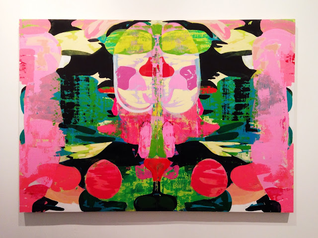
Another Splash | Acrylic on Canvas

So Christmas has finally been and gone and I am super excited to be home, put my feet up and visit family back here in the Yorkshire countryside! Before breaking up for the holidays I managed to get another painting finished (pictured above), 'Another Splash', inspired by David Hockney. 

Hockney and his paintings of California from the 70's have popped up within my research a few times, particularly because of his use of soft pastel colours and focus on the luxury of living there. I also came across an artist, Guy Yanai, who recreated David Hockney's 'A Bigger Splash' in his own style (Image of the painting here) which gave me an idea. As I have recently made a series of works based from one composition, I thought it might be an interesting idea to do the same here and paint my own 'A Bigger Splash', forming a collaborative series using one of Hockney's, Yanai's and mine. I was also imagining homes in California all looking the same; modern architecture, outdoor swimming pool, freshly mown lawn and exotic plant life surrounded by a flat blue sky. I like the idea that the houses are made from one standard mould, but once someone lives within it they take on a different personality and I think this represents that idea.

Through this process I learned a lot in terms of colour and composition which I have found to be a valuable lesson when it comes to painting. Paying attention to colour is something I have struggled with in the past as I find it difficult to get the exact colour I want before giving up. While recreating Hockney's work I was forced to focus more on colour as his soft pastels are a signature aspect of his 70's paintings. I have come to realise that I love his palette and want to try using similar colours within my own work.

Overall I'm extremely happy with how this painting turned out. I believe I've managed to capture my personality through the techniques I used to create it and through this project of doing an artist study rather than creating my own work from scratch, I've learned a valuable lesson in the use of colour and composition.

I hope you all had a great Christmas and I wish you a Happy New Year!

Saturday 19 December 2015

Light and Shadow


Just a small photo blog post of some awesome light formations I've come across in the last month or so. I think they are really interesting so I thought I'd share them with you!

Tuesday 8 December 2015

A Week Of Completion

Repose With Collage | Acrylic, Wood Veneer and Collaged Photos on Calico.

Repose Inverted | Acrylic on Calico.

Transparent Repose | Acrylic on Calico.

It's been a pretty busy week for me as it's coming to the close of the first semester which means I'm scrambling to get all my work together for hand in. Having said that, this week has been super productive as I have finally finished my 2,500 word essay and completed three paintings.

I had so many ideas which emerged from past group critiques that I really wanted to test out so I decided to make a series of paintings based on 'Repose'; a still life acrylic painting I did earlier in the module. I bought myself three canvas' and started to reconstruct a different version of Repose on each one. For the first painting I collaged wood veneer and photographs of leaves onto the surface to produce a contrast between the more fabricated areas of paint and the realistic pieces of collage. With the second painting I reversed the sections of flat colour with the areas of gestural brush strokes. In doing this the background became much more expressive in tone whilst the subject maintained flat simplistic shapes. The third painting was an experiment with thickness of paint where I used a thinner mix of acrylic to build up transparent layers so that the bottom grounds became more visible. 

All three have their positives and their negatives. I love the wood veneer and the gestural background as it creates a sense of depth but I am not so keen on the transparent paint or the subject being flat shapes of colour because it becomes simplified and too dull for my taste. My favourite from the whole series is the original Repose painting because I love the colours, composition and balance of the flat blocks of colour in contrast to the expressive areas of the subjects. However, from doing these paintings I really want to concentrate on bringing more collage back into my work especially the wood veneer as I found it exciting to work with. 


In addition to the first three experiments I also painted a few abstract close ups of Repose to see what an enlarged version of the sections would look like. I used a view finder to select a small square of the painting which I then recreated on a larger scale and these are the results of this process. It gave me the chance to play around with scale and how increasing it can affect the visual result of the painting, however I didn't enjoy doing this as much as my full scale still life as I prefer to paint the whole picture where I can focus more on depth within a composition. I rely on the negative space surrounding a still life to balance out the different shapes; the close ups are overly busy and like my painting from summer (Untitled) there is too much going on to portray the harmonious atmosphere I am wanting. 

Sunday 29 November 2015

A Room Full Of Life


So I've realised I haven't really posted much of my own art recently which is due to the fact I've been busy writing an essay for university and because of some slight laziness; sorry! I have now completed this painting, A Room Full Of Life, which I have entered into the John Moores Painting Prize. This year I am trying to engage more with the outside art world and get involved in as many external competitions as I can. There are a few other exhibitions coming up that I have submitted work for so hopefully my efforts will pay off!


As well as writing an essay I am also in the process of finishing three more paintings to complete a series of four. The composition of each painting will be exactly the same, but the process of making them will vary between them all. I am having some fun collaging wooden veneer into my paintings so I think I will do more of this in the future. Above is a snapshot of what my studio space looks like at the moment and hopefully I will get this essay out of the way so that I can concentrate on making work again!

Saturday 28 November 2015

Jonny Hannah - Main Street


The Yorkshire Sculpture Park is currently holding a solo exhibition by Illustrator Jonny Hannah. The Exhibition invited its visitors to "take a stroll down Main Street in Hannah's vintage-inspired homage to the independent trader". Displayed in the Yorkshire Sculpture Parks main building, Jonny Hannah's work provides an amazing colourful tunnel to walk through before entering the huge landscape of the YSP.


I really enjoyed looking at Jonny Hannah's playful illustrations because of the vibrant colours and gestural brushwork employed in the creation of his work. When I was at York College studying a Foundation Diploma in Art and Design, Jonny Hannah had an exhibition in the small event space on the second floor so it was great to see some of his more recent work in a different setting. I admired the curation of his work, it was packed full of colourful prints and painted objects in a bric-a-brac manner, producing an interesting and dynamic array of work to be seen. If you have not already been to see the exhibition I would really recommend it. Not only is there the amazing work of Jonny Hannah, but there is lots more art to be seen throughout the park including the exhibition Poppies: Wave and a selection of the pioneering American video and instillation artist, Bill Viola.

Tuesday 24 November 2015

I'll Show You Mine...


I'll Show You Mine...If You Show Me Yours was a fantastic exhibition curated by Leon Co, a group of level 6 students from Leeds College of Art. The exhibition, featuring the work of over 100 artists across multiple disciplines, was held at a student house in Leeds last weekend and I had one of my paintings on show in the exhibition. The aim was to pack the house with as much art as possible to create a "dialogue between disparate practices" and was a brilliant success.

The curation of the work was amazing and the use of limited space was fantastic. Upon entering the house you were instantly confronted by a wall of art displayed in the kitchen. Cupboard doors were removed to house small sculptures and an 'L' board was erected to display even more work that could not fit on the walls. The kitchen then split off to two other rooms; one a staircase leading to a basement and another leading to an emptied lounge. The stairs to the basement were lined with small paintings and a draping textile piece hung from the ceiling. The basement itself was hidden behind a black curtain that revealed two light instillations once pulled back. One was a laser circling the room like a trip wire and the other was an abstract video piece which reminded me of the sun shining through a forest. The lounge, devoid of its furniture, was packed full of artwork covering the walls and provided a perfect place to mingle and chat about the work exhibited.

Here are a few photos from the exhibition:

Doorless cupboards displaying a variety of sculpture

The stairs down to the basement

Video installation

Lasers

A corner of the lounge displaying a range of art pieces

Another corner of the lounge, complete with a rabbit sat on a chair

A video piece presented above the mantelpiece

One of the lounge walls with my painting in the middle

A closer photo of my exhibited painting

Saturday 21 November 2015

Venice Biennale Highlights


So last week I was lucky enough to visit the 56th international Venice Biennale Art Exhibition, All The World's Futures. The exhibitions took place in the beautiful pavilions at the Giardini, the Arsenale and in the city of Venice featuring over 130 artists from 53 different countries.

Entitled All The World's Futures, the Venice Biennale seeks to "observe the relationship between art and developments in the human, social and political worlds as external forces" within a world where "we are negotiating an age of anxiety".

The Biennale was an amazing avalanche of work from all over the world with a lot of art to take in over the two days I was there. There was a heavy focus on media, sculpture and instillation in the work linking back to the theme of the increase in knowledge and technology within the world.

Here is a tiny selection of my favourite pieces of work exhibited at the Biennale from the Giardini and Arsenale.

Katharina Grosse

Untitled Trumpet.


The Propeller Group

The AK47 vs The M16.

Thea Djordjadze

That is the last item on this list: A glass of anger.

Kerry James Marshall


Untitled (Blot).

Irina Nakhova

Devestatingly Direct.

Chiharn Shiota

Key In The Hand.
The work I found most interesting at the Arsenale was The AK47 vs The M16 by The Propeller Group because of its concept. The work is about the rare occasion when opposing military bullets have collided on the battlefield to form a single object. The two bullets, aimed with the intention of killing the other, fuse together in mid air under ridiculous odds. The M16 is America's gun of choice from the second half of the 20th century and is a symbol of freedom while the AK47 is the weapon of choice for liberation and revolution. Both 'weapons of peace' that are still used on battlefields today. This piece is a series of performances where the rifles were aimed at each other and shot in order to replicate the collision and fusion of the bullets. This was recorded in high speed videos and a ballistics gel block capturing the indexical mark produced by the projectiles flight paths so that they can be seen by the human eye.

I also enjoyed the work of Irina Nakhova in the Russian pavilion at the Giardini. There was something about being confronted by a huge head upon entering the pavilion that made it feel slightly haunting. The work then continued into other rooms that were transformed into environments of colour relating to the history of the 100 year old building, emphasising the significance of colour for Russian Postmodernism.

I had such a great time visiting Venice and all the art it had to offer. Such a beautiful city with loads of rich history, it was an amazing opportunity to stay there for a couple of days and absorb it all!

Friday 23 October 2015

British Art Show 8


Leeds City Art Gallery is currently holding the 8th British Art Show - a national touring exhibition that showcases the artwork of forty two contemporary artists who have made a significant impact on the art world within the last five years. Curated by Anna Colin and Lydia Yee, the exhibition covers a wide range of art that includes film, sculpture, instillation, painting, photography and design.

Living in Leeds means I will be visiting the exhibition on a regular basis and because of the diversity of work on show there is plenty to see. The art is very contemporary and many pieces were made specifically for the exhibition. A fundamental theme running alongside all the work is the "changing role and status of the object at a time of increasing convergence between the real and the virtual" which is evident in pieces such as 'Feed Me (2015)' by Rachel Maclean.

This is quite a lengthy post with lots of photos so if you would like to see my top picks from the exhibition all you have to do is click the read more button!

Monday 19 October 2015

My New Website!!!


It's finally happened, I now have a website! As part of my university course I need to develop a professional online profile. I was already doing that with my Blog, Cargo and Shop but to make things easier for my tutors I now have a Wordpress website here which acts as a hub for all my social media. It's nothing fancy, just a simple website that easily connects everything together and I just wanted to create a small post to update you on what's been going on. Please feel free to take a look, follow the links and enjoy what I have to offer.

Friday 16 October 2015

A Trip To Liverpool: Tate Liverpool and The Walker Gallery

Image taken from here

I recently went on a trip to visit Tate Liverpool and The Walker Gallery which I thoroughly enjoyed. Tate Liverpool is currently holding a great exhibition of Jackson Pollock's artistic journey (shortly closing October 18th) called Blind Spots, which I was super glad to see. Having never seen a Pollock piece in the flesh before I had an image of the exhibition being a room full of his iconic 'drippy' paintings but it was so much more than that, I never realised or fully appreciated the extent of Pollock's work and life until I saw this exhibition. There was a huge spectrum of work ranging from gouache and graphite pieces to screen prints and ink drawings on Japanese paper - It caught me off guard. I loved his work before but I love it even more now, it's something you have to see in real life to really appreciate it; the light glistening off the paint, the texture of the layers and the scale of each piece. That is something you just can't reproduce.

There was also a lot of art from other major names in the main gallery including Franz Klein, Grayson Perry, Richard Hamilton, Andy Warhol, Bruce Nauman and Rachel Whiteread. Unfortunately I didn't get any photos of the work because I didn't take my camera into the gallery but I guess there is more to life than looking at art through a camera lens.

Image taken from here

I then went to The Walker Gallery to see an exhibition called Reality which brings together major 20th century and influential contemporary painters (Francis Bacon, Lucien Freud and Chantal Joffe to name a few) to produce a fantastic show full of colour. 

My favourite artist from the exhibition was Caroline Walker with her paintings of women completely unaware that they are being observed by us as the viewer. I loved the style and concept of the viewer becoming the voyeur - something we have discussed before in our critical studies.

I also had a little peak at the John Moores Painting Prize Winners (1957-2006) exhibition while I was there. I picked out two of my favourite pieces below - Slump/Fear by Alexis Harding and Untitled (yellow Ochre) by Fiona Rae.

Alexis Harding won the John Moores Painting Prize in 2004 with his paintings based on the process of painting. Harding came to Leeds College of Art last year to talk about his work so it was great to see one of his pieces up close, I really like how he uses oil and gloss paint to make paintings of the controlled vs the uncontrolled. He uses guttering with holes in as a tool to create grid-like formations on the paint surface which I think is a really unique, clever process.

Alexis Harding - Slump/Fear
Fiona Rae's painting really caught my eye because of the superimposed marks and gestures on a flat background of yellow ochre. I really admire her use of abstract shapes painted onto a canvas as if the canvas is a object itself. These raw shapes, flat tones and colourful marks are something I really want to try and incorporate into my own still life paintings in the future.

Fiona Rae - Untitled (Yellow Ochre)

Wednesday 14 October 2015

Inside The Studio: Photo Every Hour

So Amy recently decided to take a photo of what she was doing every hour for a day to give an insight into what she does. I didn't realise this style of post was a thing but it is, and it's great! Anyway I decided to do one too as I thought it was a really cool way of showing you what a typical day in the studio is for me. I sometimes think my family and friends from back home think I go to university to paint pretty pictures all day, which would be amazing, but there is more too it than that. This is a short, visual 'day in the life' kind of post and I hope you all find it interesting.

10:00am - Straight into the studio first thing on a morning - This is my studio space at the moment.

11:00am - While waiting for paint to dry I make notes and draw ideas out in my sketchbook.

12:00pm - Finally finished a piece I have been working on this week. I'm super pleased with how it turned out!

1:00pm - Now its time for some photoshop and research on the Mac's. Documenting work seems to be never-ending. 

2:00pm - I also spent some time creating a website using wordpress. Link to my new site is here.

3:00pm - It got to that point in the day where I didn't want to start anything big so I decided to record some of my exhibition visits in my journals.

4:00 - Home time! A view of my wonderful university.

Monday 12 October 2015

Poppies: Wave Exhibition


Wave was originally a huge arch of red ceramic poppies cascading from a high window of the Tower of London to the ground. Now, a year since that exhibition, the amazing sculpture has made an appearance in the Yorkshire Sculpture Park as part of the 14-18 NOW programme. The sculpture was part of the Blood Swept Lands and Seas of Red instillation in the autumn of 2014 and the red poppies serve as a memory to those who lost their lives during the First World War.

I never managed to see the instillation down in London so it was fantastic to see it here in Yorkshire. The backdrop of the YSP is spectacular with acres of land to walk and explore which gave you perfect time to relax and reflect on the piece. I love how the poppies rise from the surface of the river and flow over onto the bridge, it's got great shape and movement. Unfortunately the sun was in the wrong position so getting a front view photo of the fantastic red wave was near enough impossible but I tried my best to get some photos that served it some justice.
Masking Paint. All rights reserved.
Blog design by labinastudio.