Friday 29 May 2015

Daily Drawing Update - Week One

The idea of doing a drawing-a-day was always something I really wanted to do but never had the motivation for... until now. After following people such as Augustwren and Mogutakahashi on Instagram, it has given me the inspiration to pick up this challenge. So Amy and I bought Moleskine sketchbooks with the intention of keeping this challenge running for as long as we can, and every Friday I will blog my drawings from the past week.
#1 - Amy and I had a Budweiser and a packet of Reese's Peanut Butter Cups to celebrate our Uni results.
#2 - We went to Saltaire to visit the Salt Mill. We then sat in the park with some fish and chips and watched a young family play in the river with their cute Chihuahua.
#3 - I bought these flowers for Amy ages ago and they are still a colourful addition to the flat windowsill.
#4 - This was a small hanging metal sculpture I made in my workshop induction way back in October.
#5 - Fruit and Veg, gotta get that 5 a day. What should be my fifth?
#6 - The pattern on the shirt I wore out that night.
#7 - Mornings are saved by these cups of tea.

Wednesday 27 May 2015

Art Journal Review - Frieze

May was the opening of the 56th International Art Exhibition entitled All The world's Futures curated by Okwui Enwezor at the Venice Biennale, featuring 136 artists from 53 countries. As it is the month of the opening, art journals and magazines are taking the opportunity to review and feature the exhibitions currently on show in Venice so there is plenty to read about it. I was flicking through Frieze and came across an interesting interview with Sarah Lucas (who is representing Britain at the Biennale) about her views on creativity, politics and the British culture.
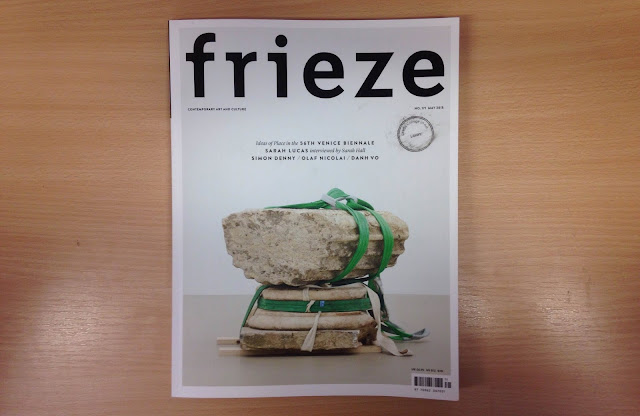
Front Cover of Frieze, No. 171
Novelist Sarah Hall talks to Sarah Lucas about sculpture, sexual politics and representing Britain at this year's Venice Biennale
For those of you who are not familiar with Lucas' work, it is very sex orientated with visual jokes and innuendo (although you can probably already tell from the images). She then goes onto talk about how she has always had a 'deep-seated reservation about sex' and uses this sense of embarrassment when making art 'to work out what might be provocative or what isn't'. She often finds people become very self-conscious in front of some of her sculptures because they suddenly realise they are surprised by it, which I guess is the same feeling a young Sarah Lucas had when she saw provocative scenes on the telly.

Lucas also talks about how she views her own creations saying:
'Well, I don't have to know the answer.' That was a very liberating moment: understanding that the power is in the power of the thing, not in me trying to be aggressive or being one way or the other'
This was in the fact that Lucas felt like she had begun explaining things to much and was constantly trying to justify her work when she could let the work justify itself with the energy it holds. It took a moment of standing back and thinking for her to be able to understand this.


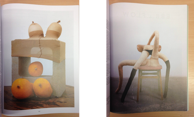
Diego (detail), 2014 | Pepsi & Cocky, 2008
Lucas and Hall then go onto discuss the strange differences of the nude male body to the nude female body within media. They point out that you won't ever see a penis, bum or the bare back of a man on page three, even though they would both quite enjoy it. This, according to Hall, is because 'women like to look at women and women buy books, so that's the audience they're going for. A man, a naked man, is supposedly not going to work as a cover'.

There were some other interesting topics brought up in the interview such as plastic surgery, political stance and beauty in sculpture. I really enjoyed reading the article, especially as I have a deposit down to visit the Biennale with University in November so I will see Sarah Lucas' work first hand in the British pavilion and I can't wait!

If you want to read the full article, click here

Monday 25 May 2015

Chapter Four/ Five Exhibition

 Chapter Four / Five logo design | Photo taken at the preview night
Chapter Four/ Five is an exclusive exhibition held for limited time at the Leeds Central Library featuring the work of Leeds College of Arts level four and five Graphic Design students. The featured work consists of book cover re-designs of seminal texts in their own personal interpretation bringing a more contemporary feel to the dated academic works.

In the exhibition the covers are displayed in a grid-like pattern with each one standing as a poster for the chosen theorist, philosopher or culture theory book. The level fours had to also produce a full 'jacket' for the book complete with a front, back, spine, blurb, publisher logo and ISBN number but that wasn't displayed in the show. The level fives had to produce the cover using a process of their own choice but limit themselves to only two colours plus stock.
Some of the works I managed to photograph during the preview night
I really enjoyed the exhibition as it is was a fresh insight into what the Graphic Design students have been working towards at the end of the year. The work was professional, the atmosphere was buzzing and the beer was refreshing. Nothing particularly stood out to me as they were all quite similar in style and colour but that was probably because they were all based on similar books. This however did not detract from the overall quality and effort that was obviously put into designing them and above all it was a great evening with a great selection of design.

Sunday 24 May 2015

The Arrival Of Spring Exhibition

The Arrival of Spring - Salts Mill Gallery Space
Seeing as it was a beautifully sunny bank holiday weekend I decided to go to Saltiare with my girlfriend to visit the Salts Mill and see the collection of David Hockney iPad drawings. The Arrival of Spring is a series of detailed studies of the changing seasons on Woldgate and are made by using an iPad. Hockney finds using the iPad 'simply faster' as you can capture the landscape quickly, choosing colour and brushes more rapidly without the drying time of the paint.


I really enjoyed The Arrival of Spring exhibition. All of the digital paintings contain beautiful colours and I love how the greens, reds, blues and purples sit next to each other. The colours are so vivid and I am a sucker for bright colours so they instantly caught my eye. I also like the impressive size of the five foot prints especially when they are all displayed together as you can immerse yourself in the wonderful colour. I think that they look best from a slight distance because the closer you get the more you can see the digital marks made by the brush tools which I believe lessens the appeal. Overall it was a fantastic day filled with sun, fish and chips and some great art by David Hockney.

Saturday 23 May 2015

Going Going Gone - Foundation Exhibition

Going Going Gone
Going Going Gone is an exhibition hosted at Leeds College of Art Vernon Street site featuring the end of year work from the foundation students of 2014/15. With the preview night on the 21st May kicking off the week long show it was a great opportunity to go and see what the fellow LCA students have been up to on their foundation course this past year and I have to say, I was impressed! Through the mass of visitors eagerly looking at the impressive collection of art I managed to photograph some of my personal favourites which I will share with you.

Hayley Devlin | David Knowles | Nirvana Jalalvand
Tess Bratkowski | Alice Vaughan
Isabel Cooper | Amber Winter-Moore
Megan Naylor-Wardle | Hannah Ackroyd
Debbie Talia Misan | Eleanor Massey | Matty Mancey-Jones


I really enjoyed walking around the foundation's Going Going Gone exhibition. Having not been to the Vernon Street site to look around more than the ground floor it was a great opportunity to see some inspiring art, design and fashion as well as the historic building. I especially loved the fine art studios because of the diverse array of pieces ranging from photography, sculpture, drawing, media and performance. Being a Fine Artist I guess my opinion is bias on which studio I preferred but the quality of work did not decrease in any of the other areas. There was some great illustrations accompanied by zines, interesting jewellery made from bone and maggots and vibrant fashion items to complete the collective of work. If you are free between now and the 28th May the Going Going Gone exhibition is something you should really consider visiting.

Friday 22 May 2015

Short Film City

Short Film City presents a selection of the best animations from French film schools and on Monday 18th May I went to Vernon Street to view them on the lecture theatres big screen. Here is a few of my favourite ones I have picked out because of their professionalism, colour, style and concepts.

(Gobelins, I'école de l'image - Paris)
Janis Aussel/ France/ 2014/ 3 min 29
The harmony of a duet of acrobats is broken by the decision of one member to start a solo career.


(La poudriére - Bourg-lés-Valence)
Reza Riahi/ France/ 2014/ 4 min 10
What is right and what is wrong? A soldier struggles to follow orders as he thinks back to more peaceful times.


(EMCA, École des Métiers du Cinéma d'Animation - Angoulême)
Marine Laclotte/ France/ 2014/ 14 min 26
Franck lives by the sea. He is alone, but thanks to crabs Franck is happy.


(Supinfocom Rubika - Valenciennes)
Marion Bordeyne/ France/ 2014/ 8 min 50
A young woman finds herself while hiking on Easter Island.


Having never been to see a short film show and with little knowledge of animation, I really enjoyed this new experience. The quality of the animations was fantastic, each made using different materials and processes keeping it fresh to watch. The  selection on show was also great with deep and hard-hitting narratives to keep you thinking even after the show had finished. The french narration was recorded with great quality and the subtitles meant you had to concentrate meaning the words really sank in. Overall the Short Film City event was an exciting event which I am glad to have attended so I thought I'd share my favourite ones with you.


(click the title of the animations to take you to their Vimeo page) 

Out With The Old, In With The New.


Today marked the official end of my first year at uni (which has gone so fast!) with a meeting bringing us all together for one last time before we all disappear for summer.  It consisted of some brief information regarding local exhibitions, plans for level 5 and the student rep re-election process (which I ran for and was elected, whoop!). 

As my first year is over and have received my results I thought I'd post a little self evaluation of my recent modules. Since being put into the painting strand I have experimented with painting and painting techniques as part of a 'Materials and Processes' module and a 'Fine Art Practices 3' module which focused on strand specific practice.

I first started off by painting landscapes (just chosen from a sheet of paper our tutor gave us) using different paints and painting techniques such as solid tone, transparent layers and removing layers. I really enjoyed the challenge of applying the paint in different ways creating different tones and textures. 

Painting task experimenting with different ways of painting.
Transparent layers.
Oil on MDF board.
Painting task experiment using different ways of painting.
Solid tone.
Acrylic on paper.

Once done with painting landscapes we were able to bring in our own imagery. I went with the theme of religious art which after some reflection on my part, was a bad move. These religious ideas seemed to limit and constrain me and even though I was looking at Renaissance painting I couldn't move forward. So after a helpfully unhelpful group critique (in the respect that everyone was stumped with what direction I should go) I decided to go back to what I really enjoyed - Landscapes. During a 4 week project where I loved painting landscapes, I figured this was a natural theme I am comfortable painting.

Trying to limit my colour palette for a challenge.
Black and grey.
Acrylic on paper.

I then tried adapting it a bit by painting some vivid landscapes based off old holiday photos. The aim was to create a surreal, dream-like scene triggered from memories captured in photographs from the past. I wanted to combine the bright, exotic nature of Henri Rousseau paintings with the rehearsed gestural movements in Alex Katz paintings. I think I managed to successfully combine these two ideas as well as put in my own style of painting and I am pleased with what I have started to develop.

Trying to merge together landscape imagery into one dream-like scene.
Oil on paper.
Trying to merge together landscape imagery into one dream-like scene.
Oil on paper. 

This concluded my practical work for the year and I have positive feelings to where I am, and where I will head between now and the start of level 5 in September. My tutors believe there is confidence and maturity in my most recent paintings which I should continue to explore next year. I plan to do lots more bright paintings of landscapes (but without the distracting black lines) in the near future to test and find a style I really like so that I hit the ground running in my second year of uni.

Tuesday 19 May 2015

Welcome!


So this is my obligatory 'Hello world!' type post about my new (and first) blog! As it mentions in my bio I am a 20 year old Fine Art student currently studying at Leeds College of Art and so far I have learned a lot about myself and my practice. I have just finished my first year (which has gone by so fast!) and I have decided to set up a blog as part of my Personal and Professional Practice which is a module that runs throughout my course. As a slight technophobe I have forever stuck to working in sketch books out of fear for having to learn the blogging life, but today I have bitten the bullet! So from now I will be blogging all sorts of things from my own practice to exhibition visits to inspiration, and I invite you to join me on my journey. Feel free to look around, comment and revisit soon.

Jake :)

Masking Paint. All rights reserved.
Blog design by labinastudio.